Cookie Typeface
2024
Typography
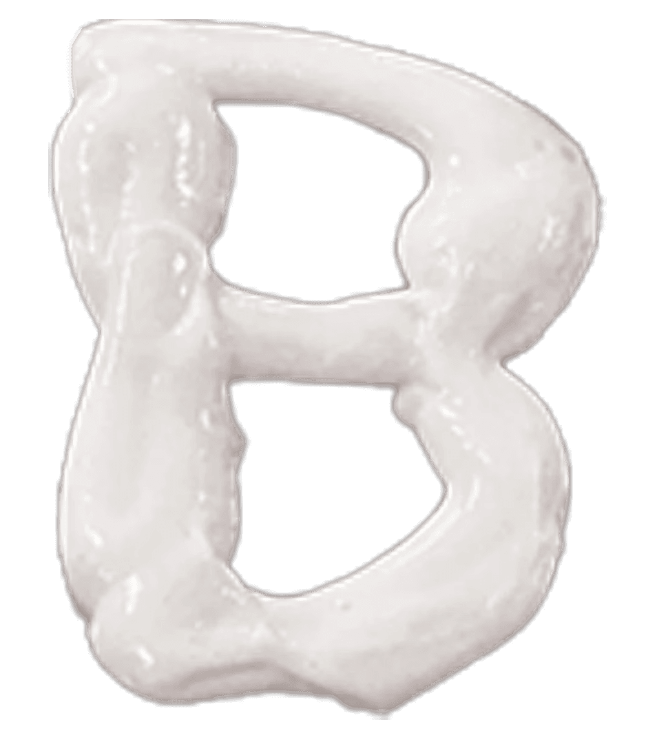
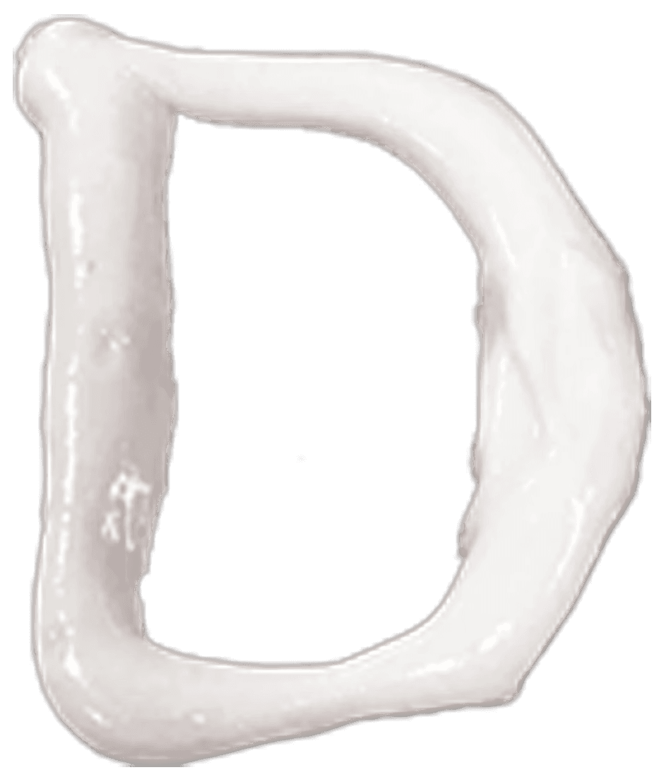
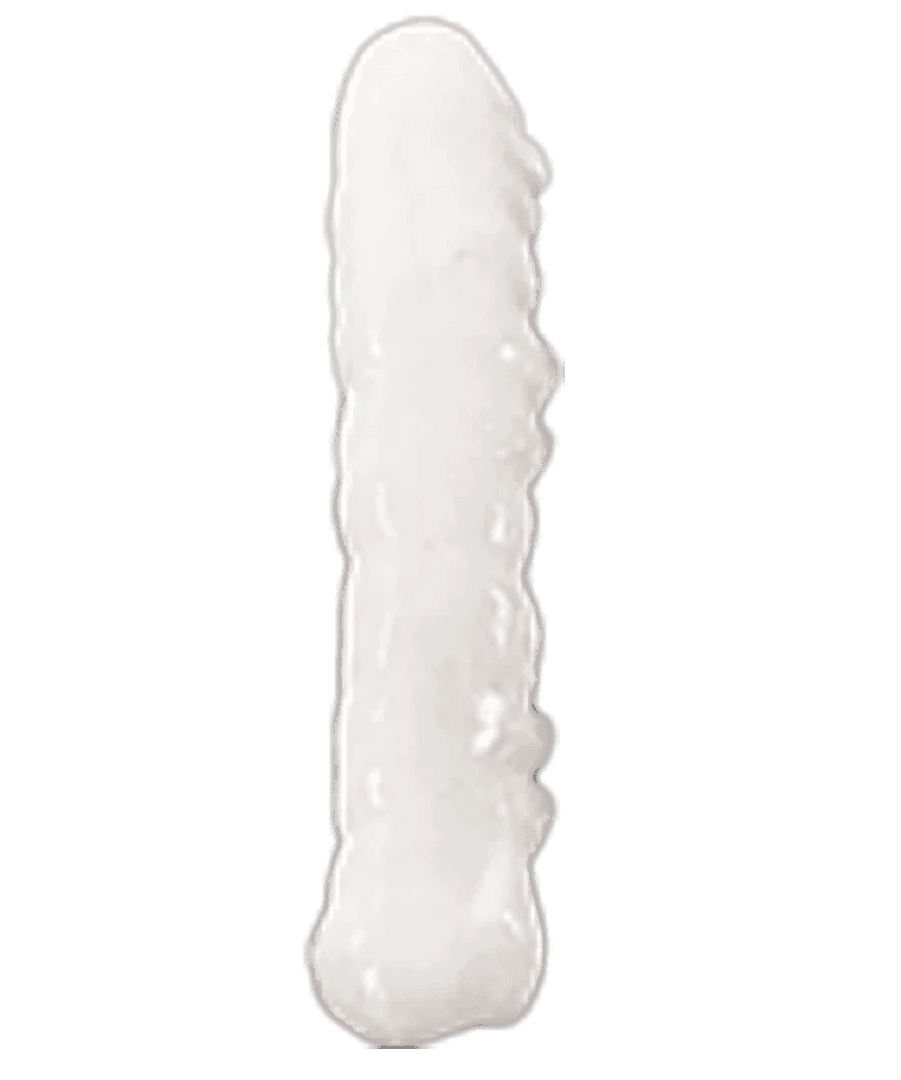
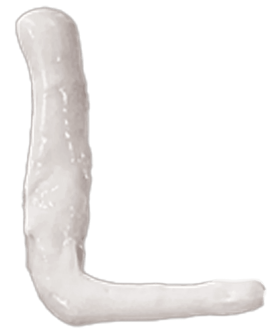
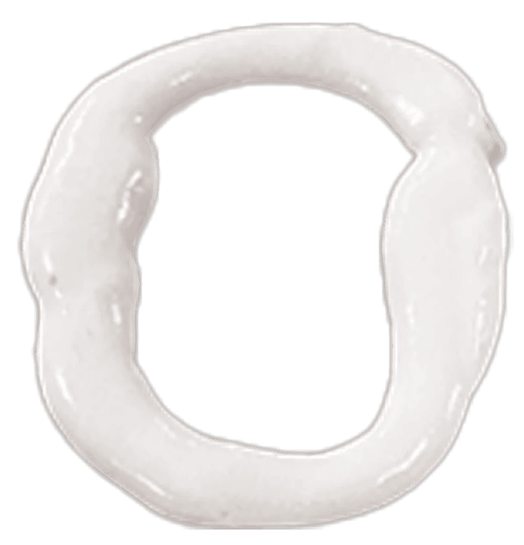
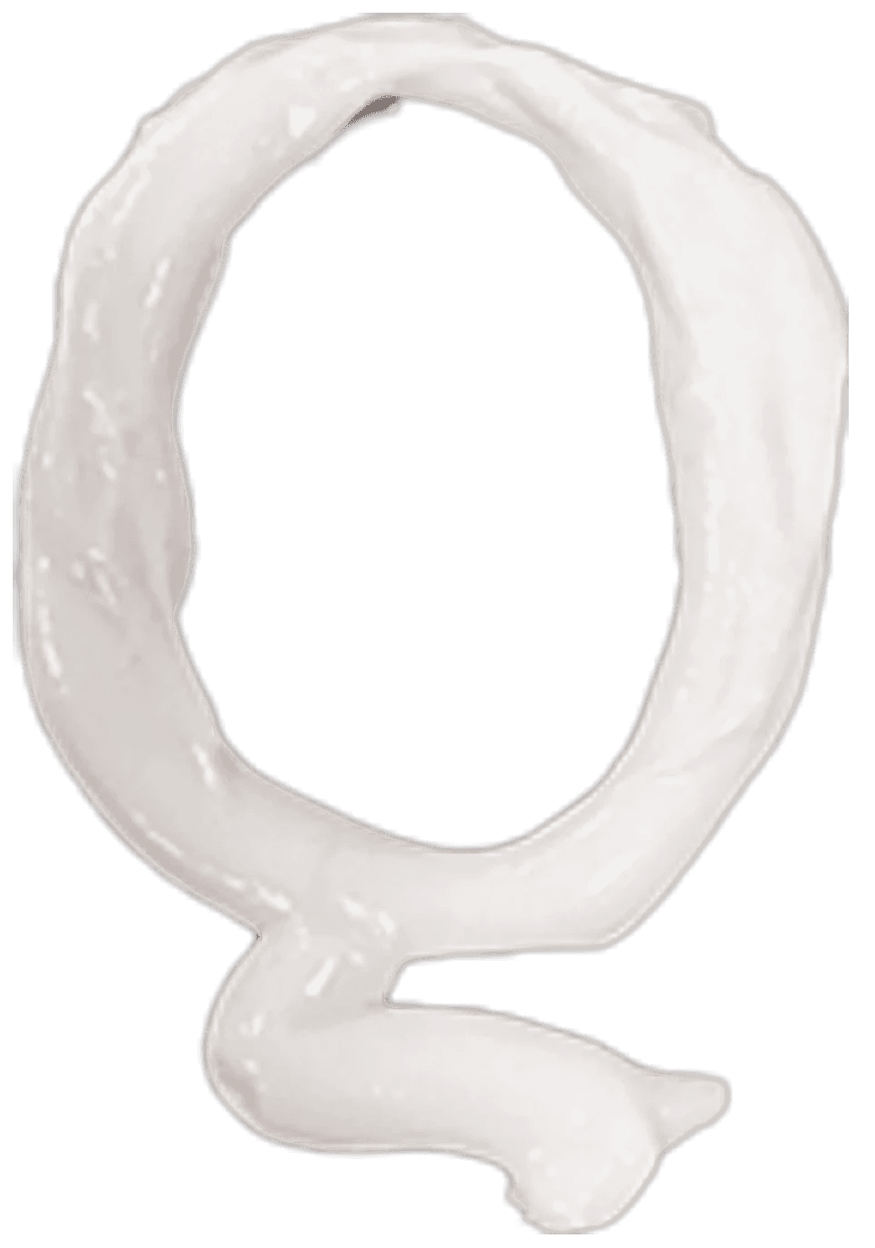
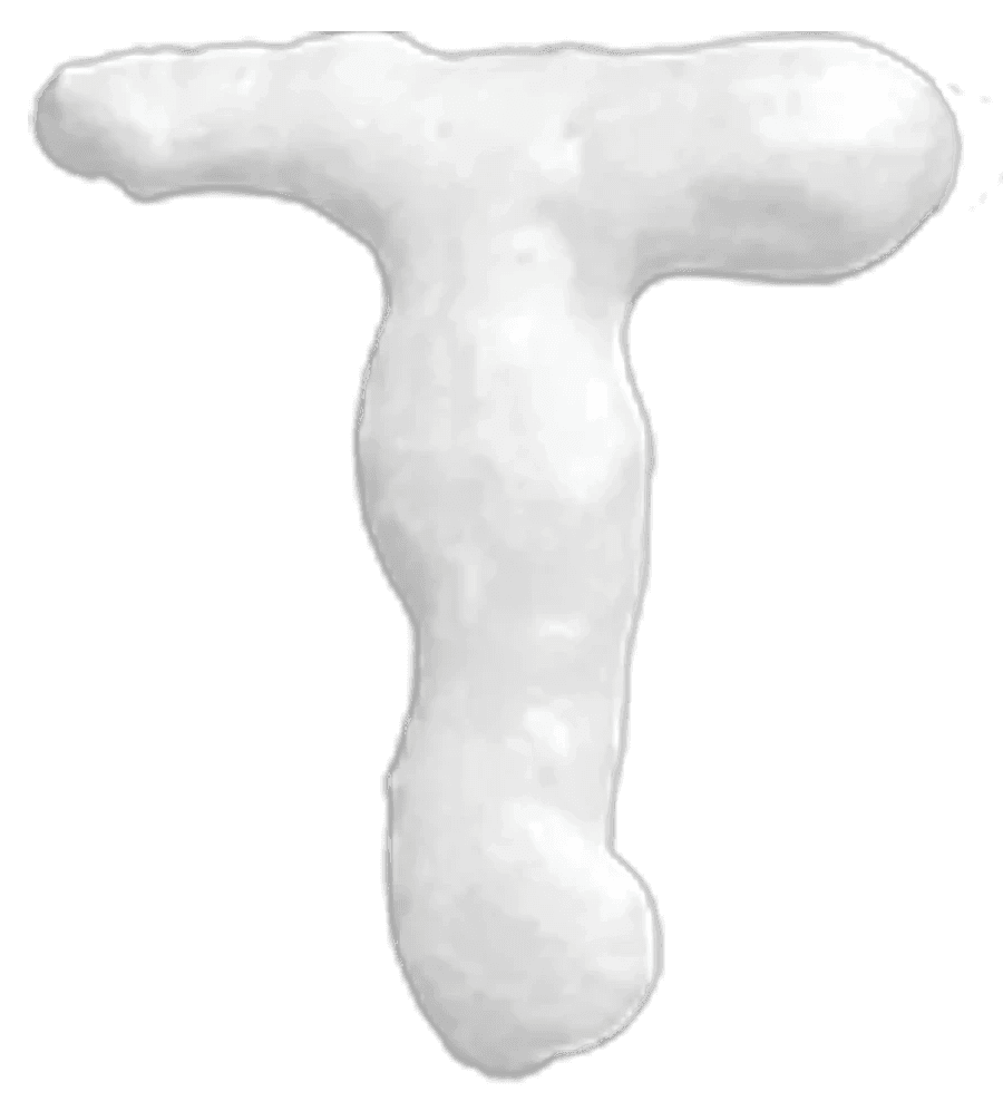
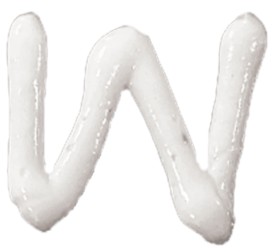
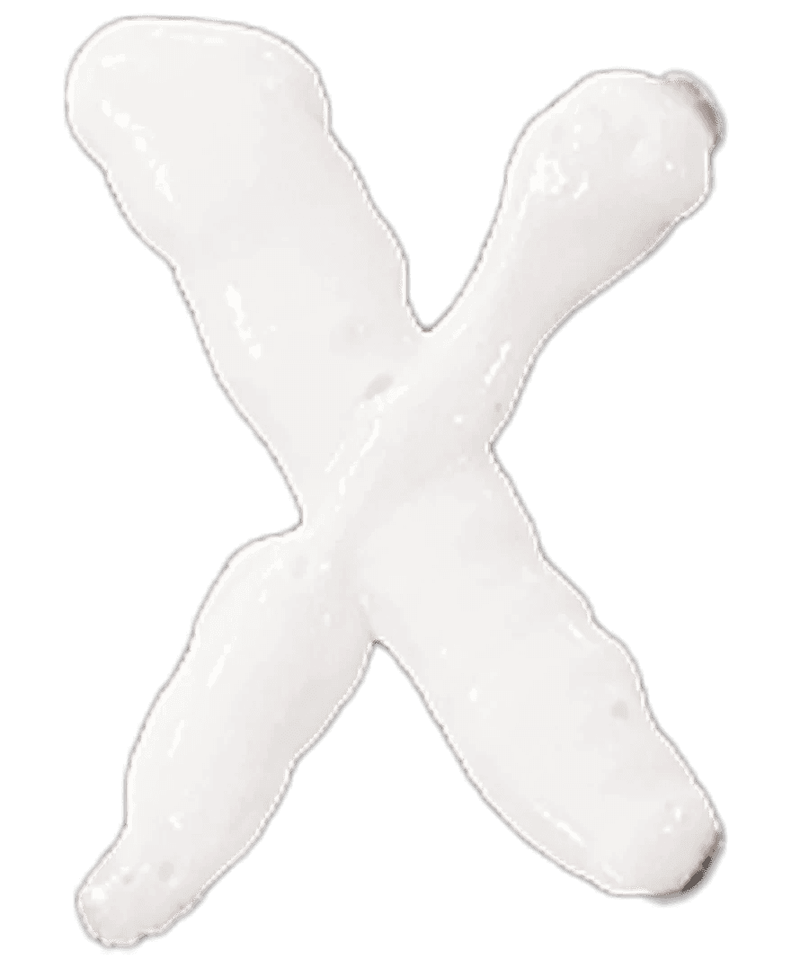
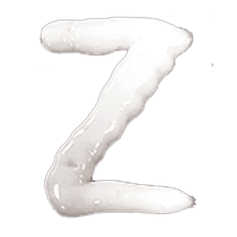
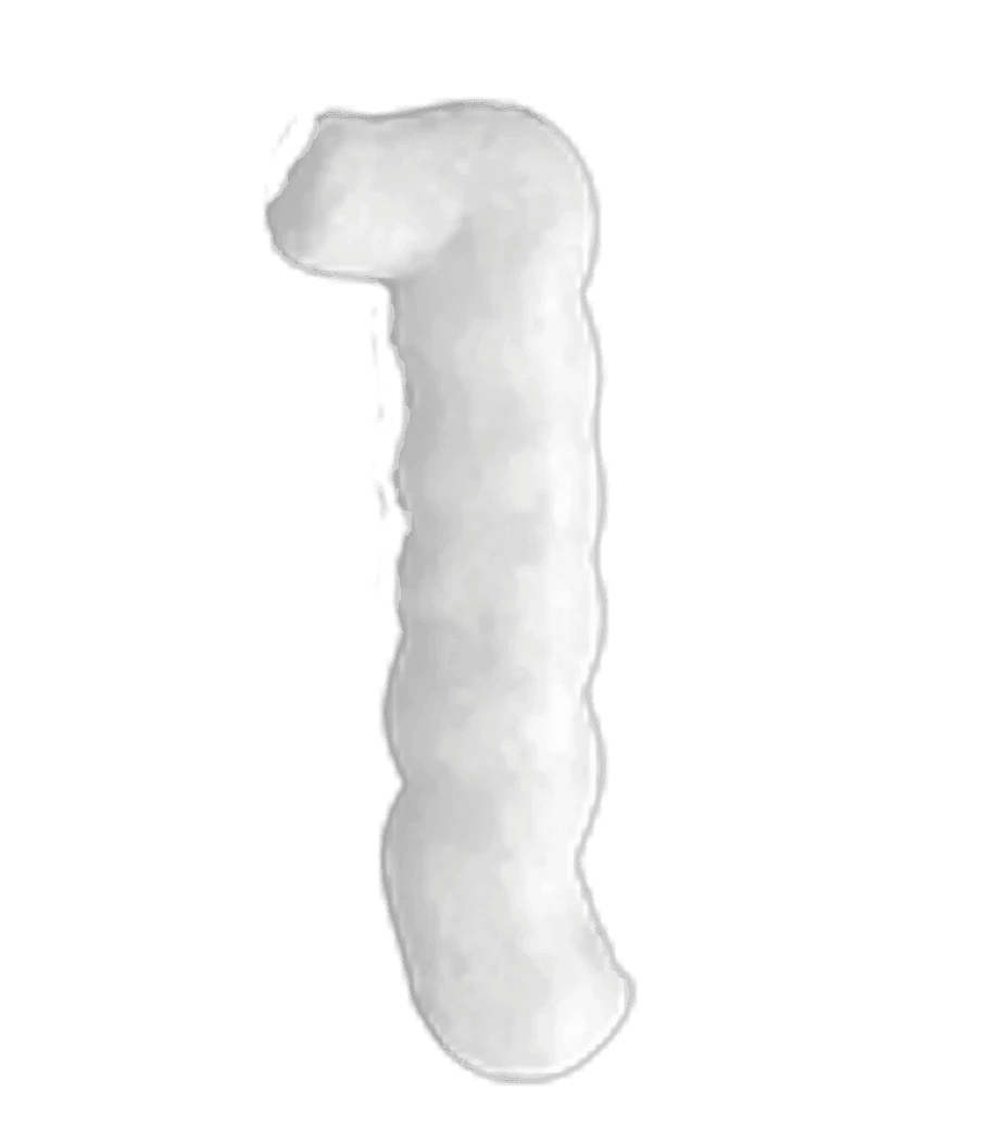
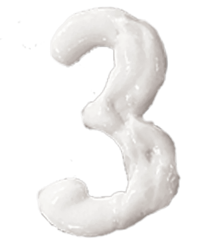
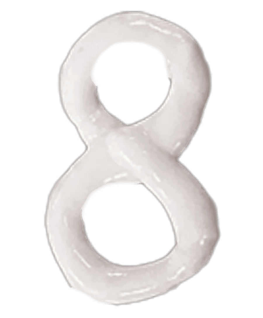
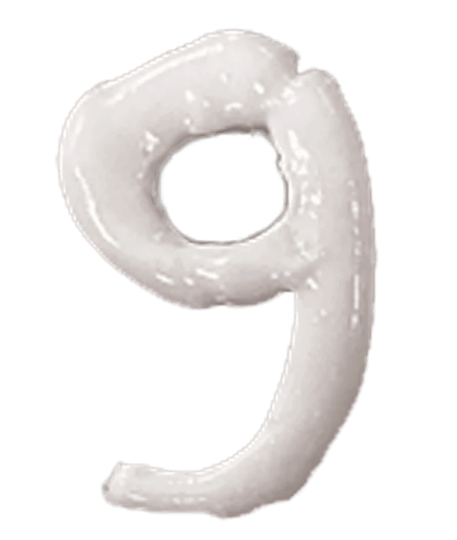
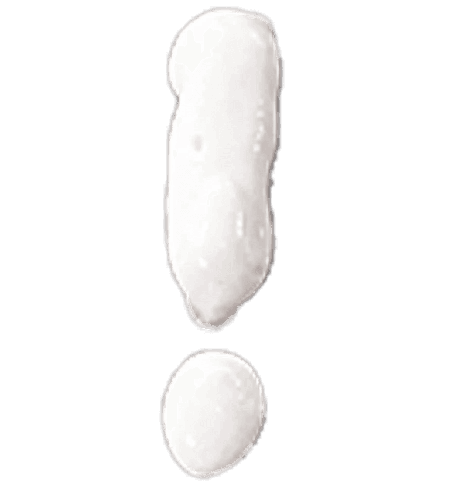
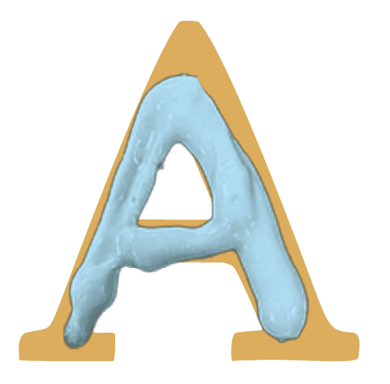
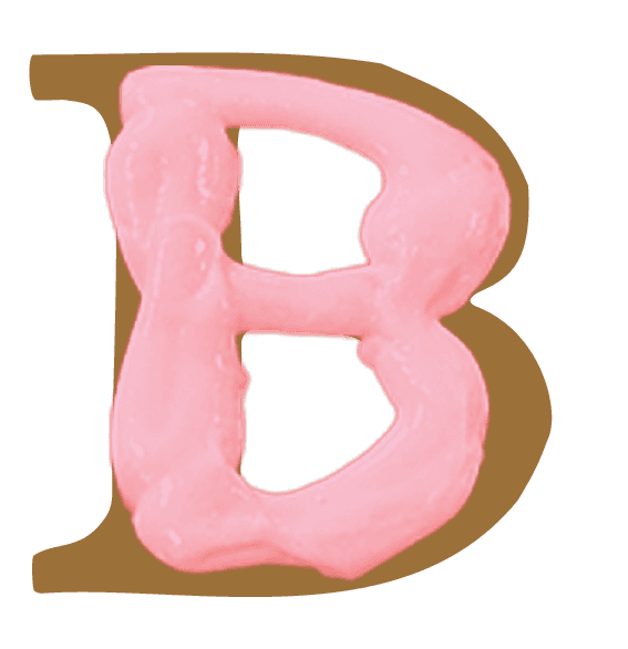
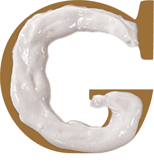
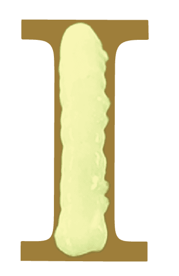
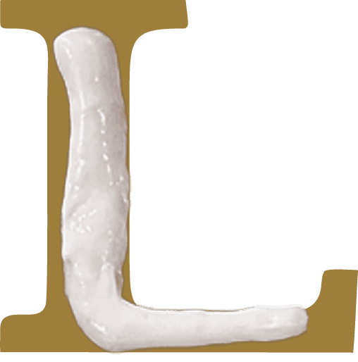
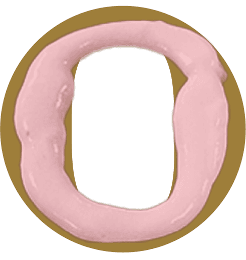
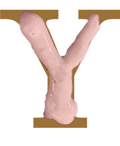
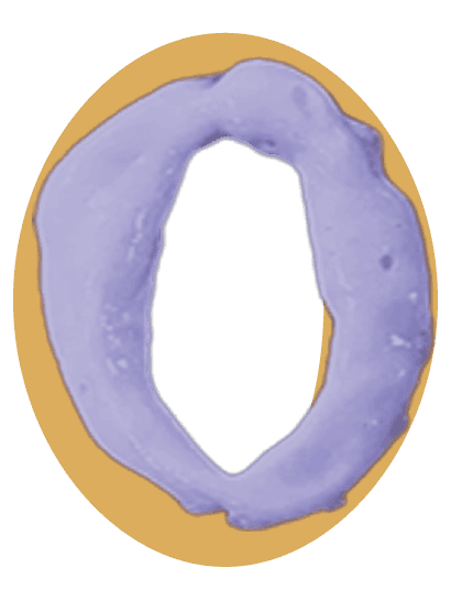
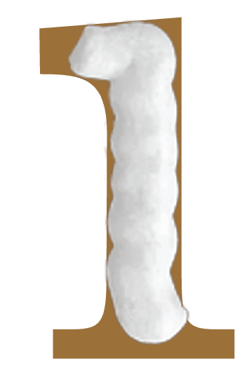
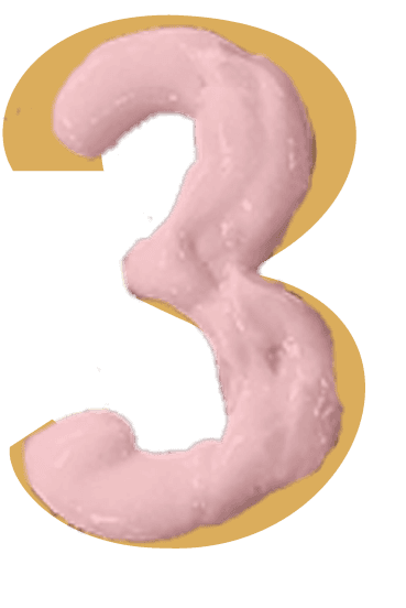
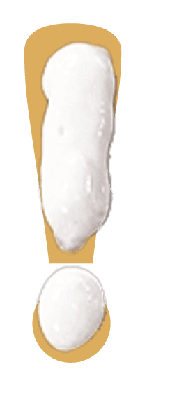
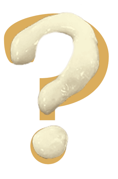
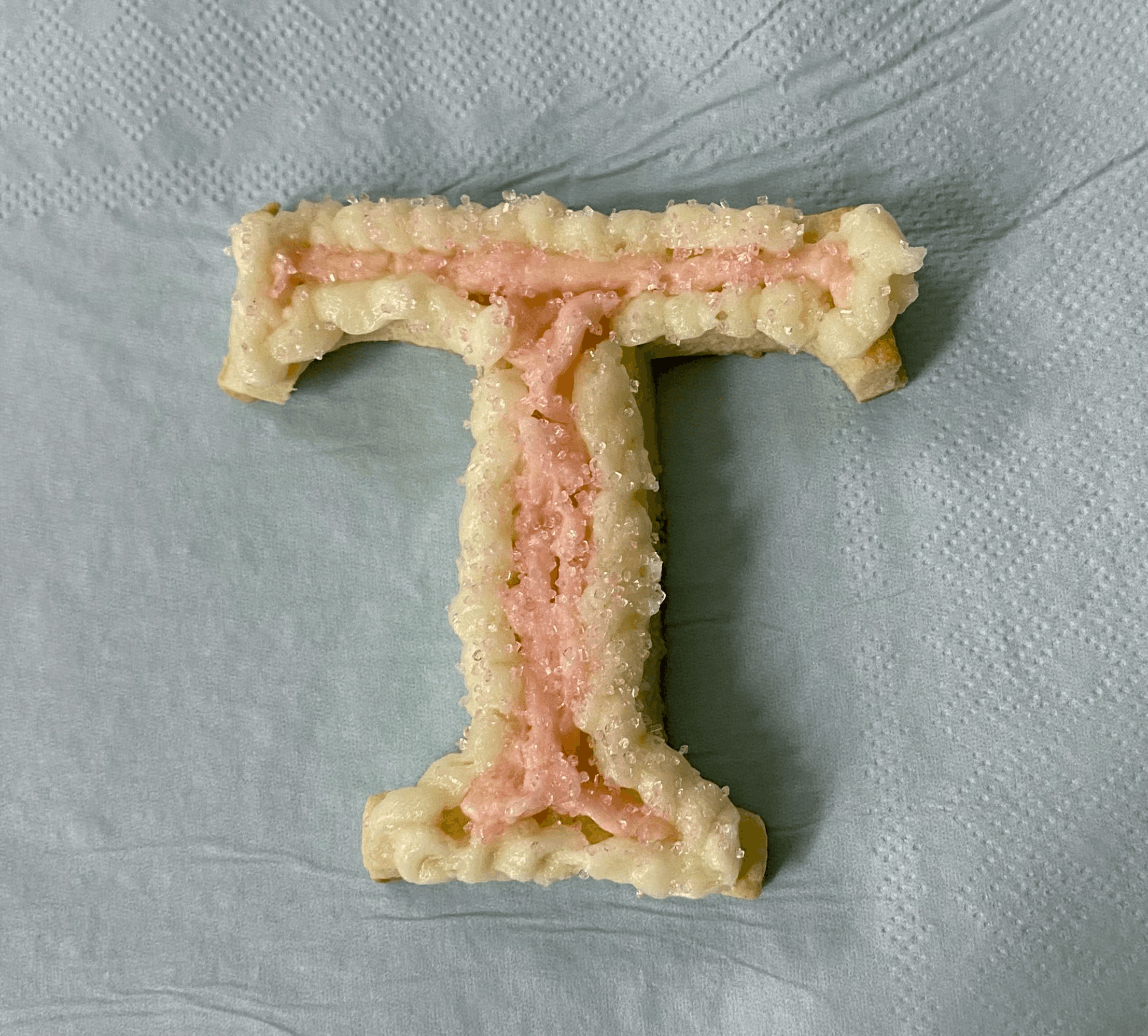
Inspired by the shapes and frosting designs of sugar cookies, this decorative typeface celebrates creativity and collaboration. Designed with two layers—a base representing the cookie and a top mimicking the frosting—it allows for versatility, functioning as separate elements or as an overlay.
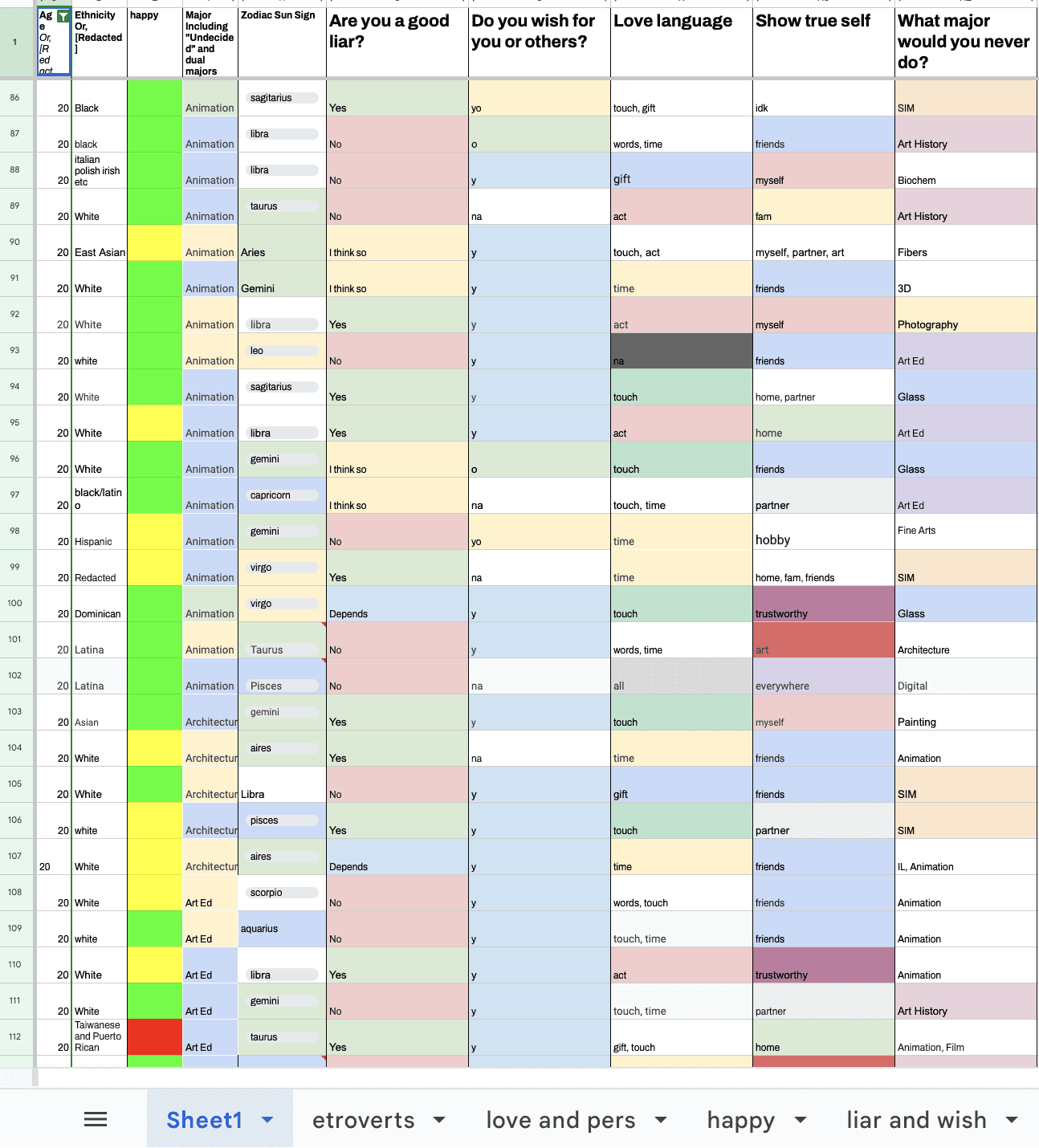
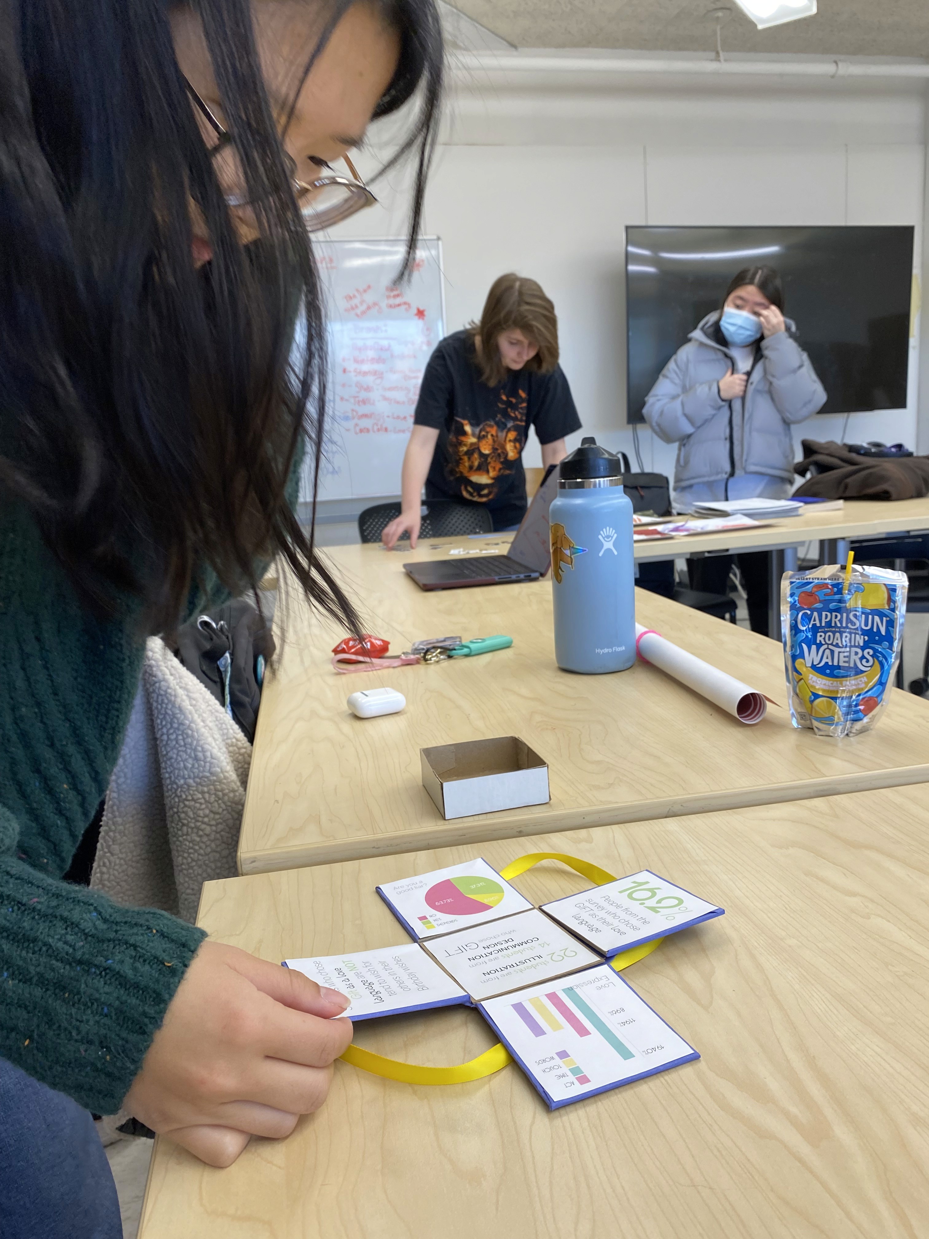
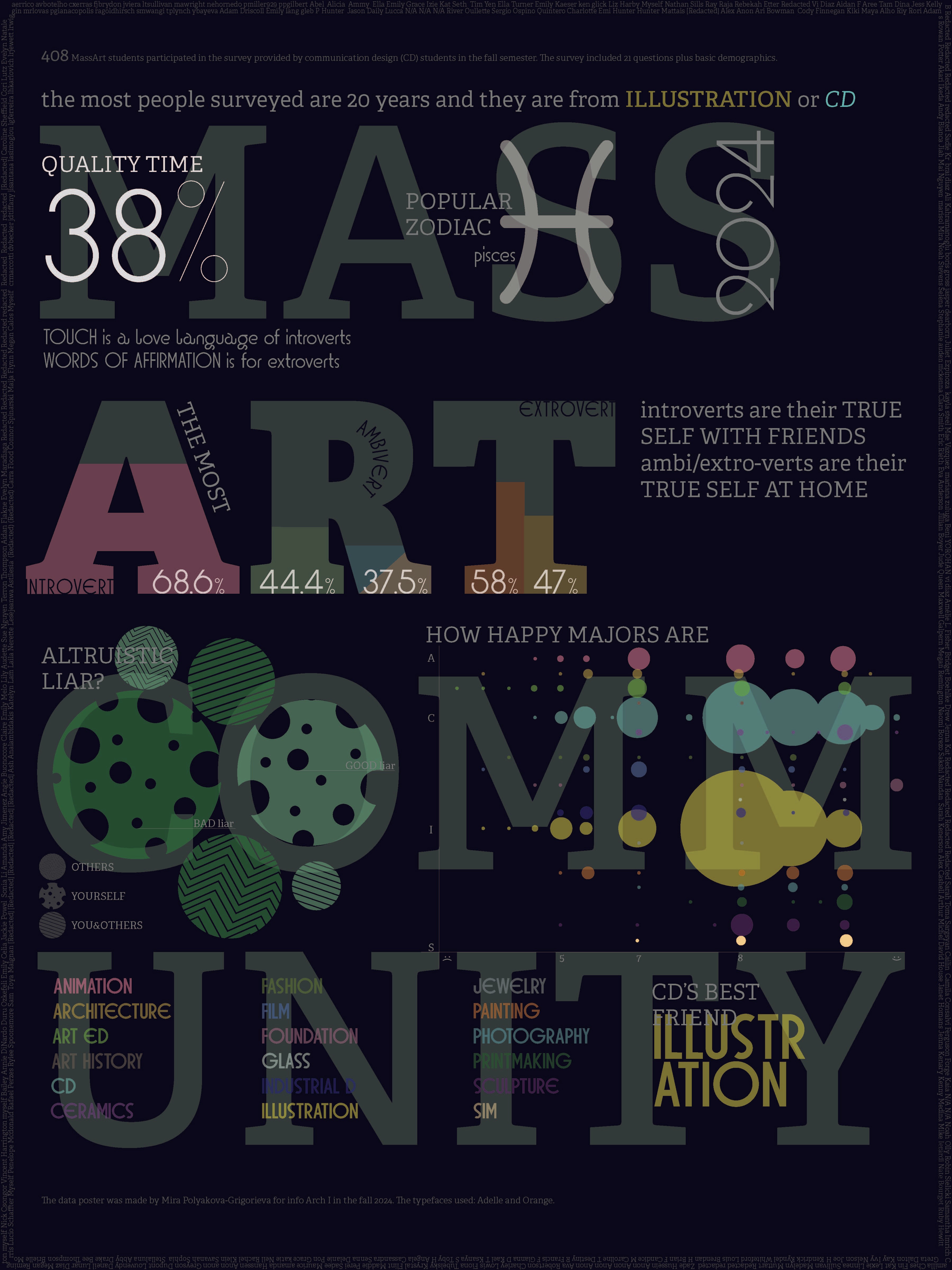
The typeface is the result of a collective effort involving 408 MassArt students. Through a survey of 21 questions, participants selected letter-shaped cookies and decorated them in response to prompts, turning personal expression into visual design. This playful project captures the individuality of each contribution while uniting them in a cohesive and functional typographic system.


Process
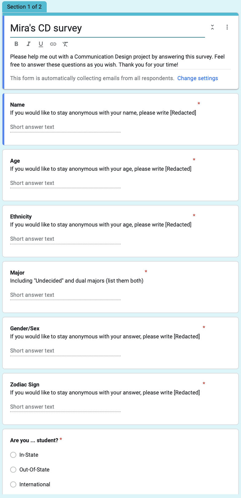
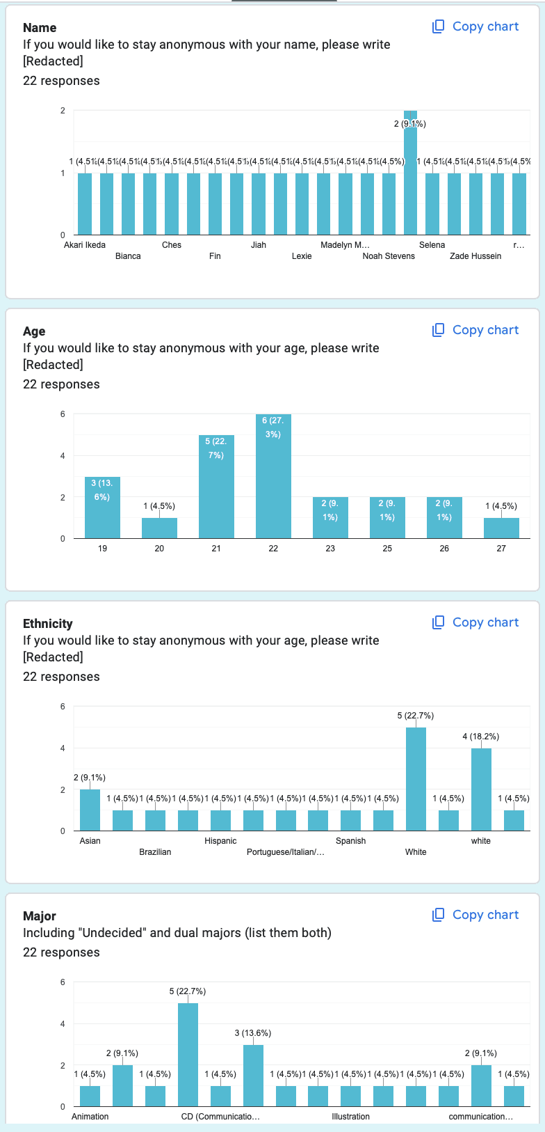
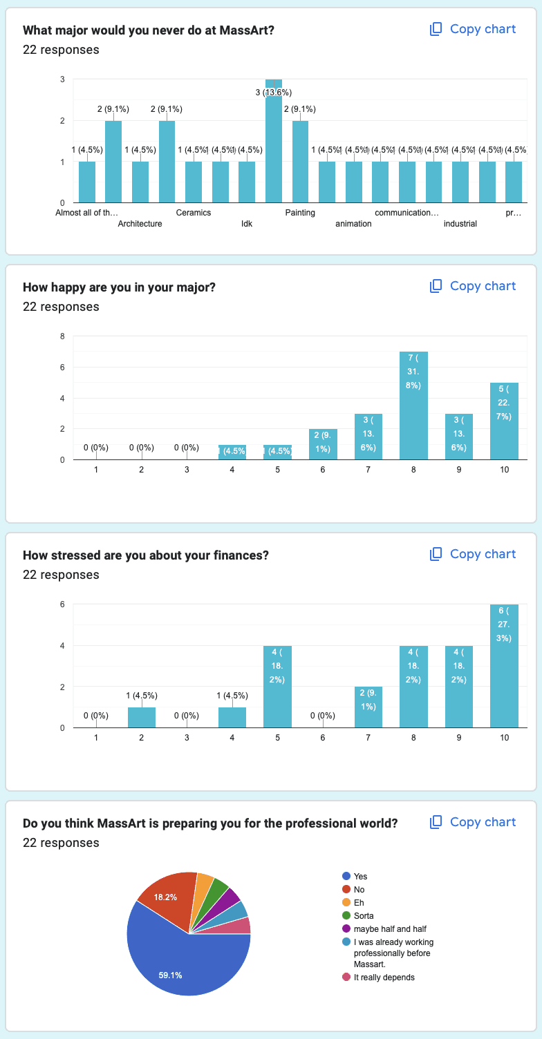
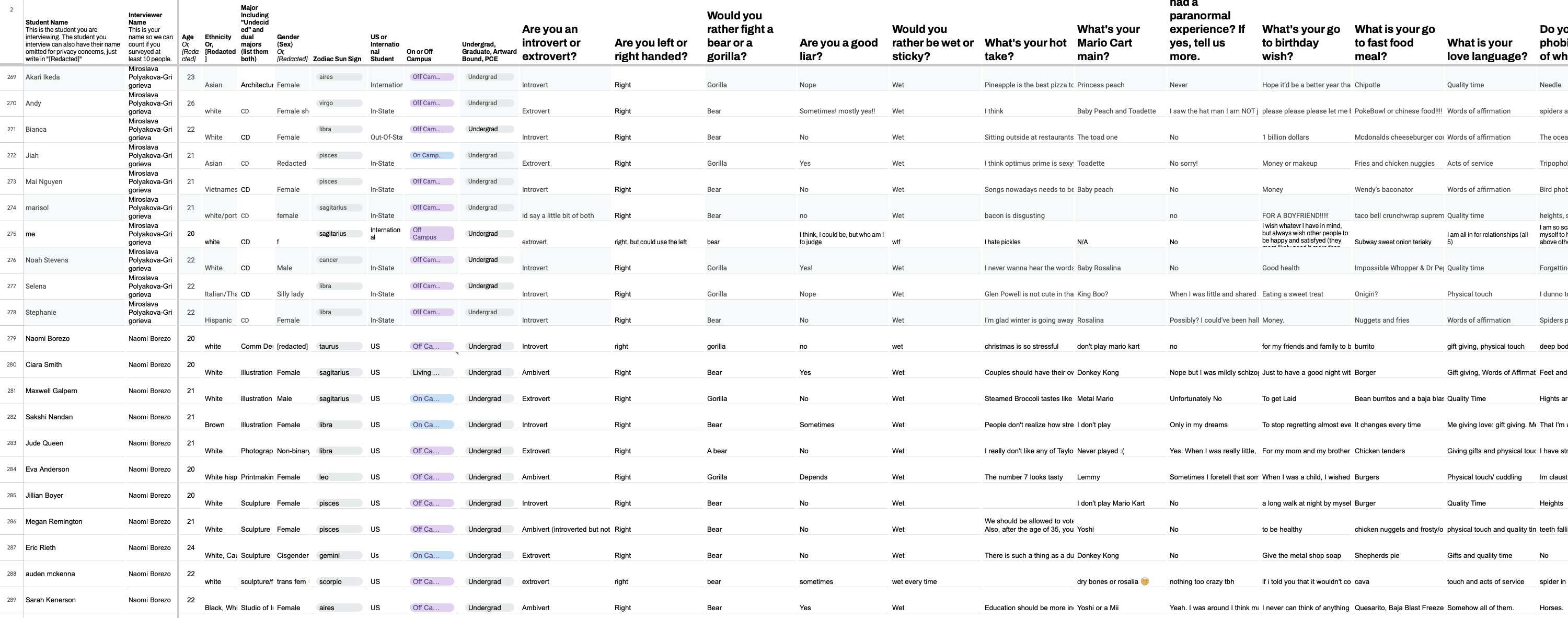
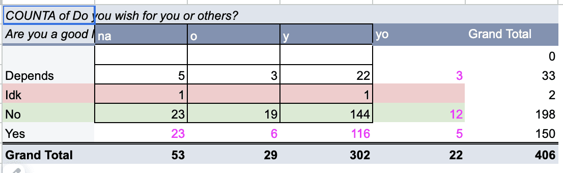
To start I've created a Google Form for students to answer the questions. After getting the results I organized the data for further use to better see the data story.
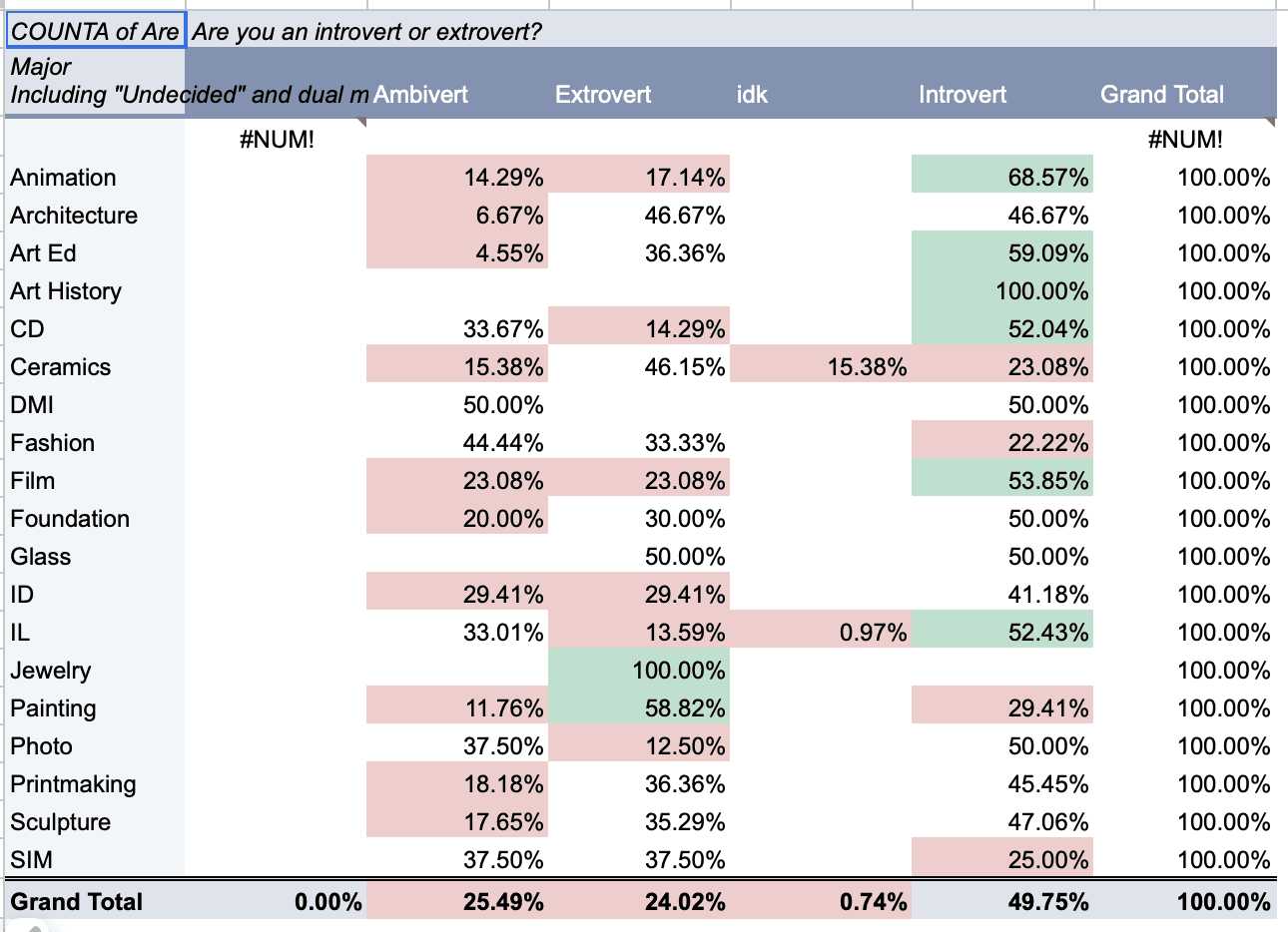
Based on the student's responses, we had to make several one week projects, that will lead us to a three week final. I made a couple of one week data visualizations, such as poster and a sequence piece.
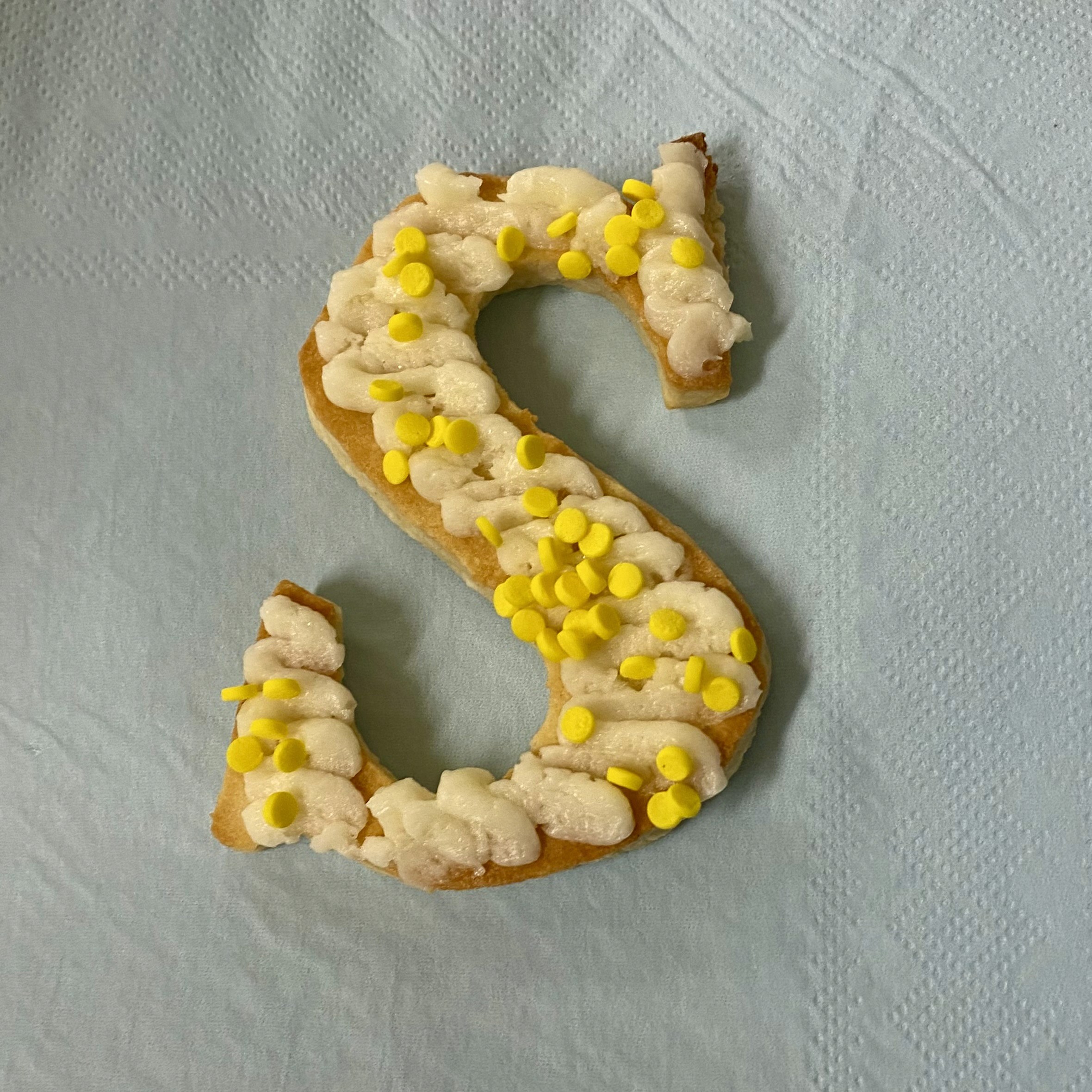
After playing around with those projects, I decided to pick a final topic that I am interested in, and my eye fell on typography. I thought of an interactive and delicious way to collect data. I made type cookies! I cut 47 letter cookies with my knife to make sure I will get definitive Sans Serifs and Serifs letterforms. The students were given a task to choose the type classification they use commonly in their designs.
The frosting color choice is showcasing what color tones they usually use: earthy colors–green, cool tones–blue, warm tones–pink and white for black and white designs. Next–the sprinkles, that will demonstrate how decorative you works are. More sprinkles–more decor they are using in their works, less–they go for more minimalistic look.
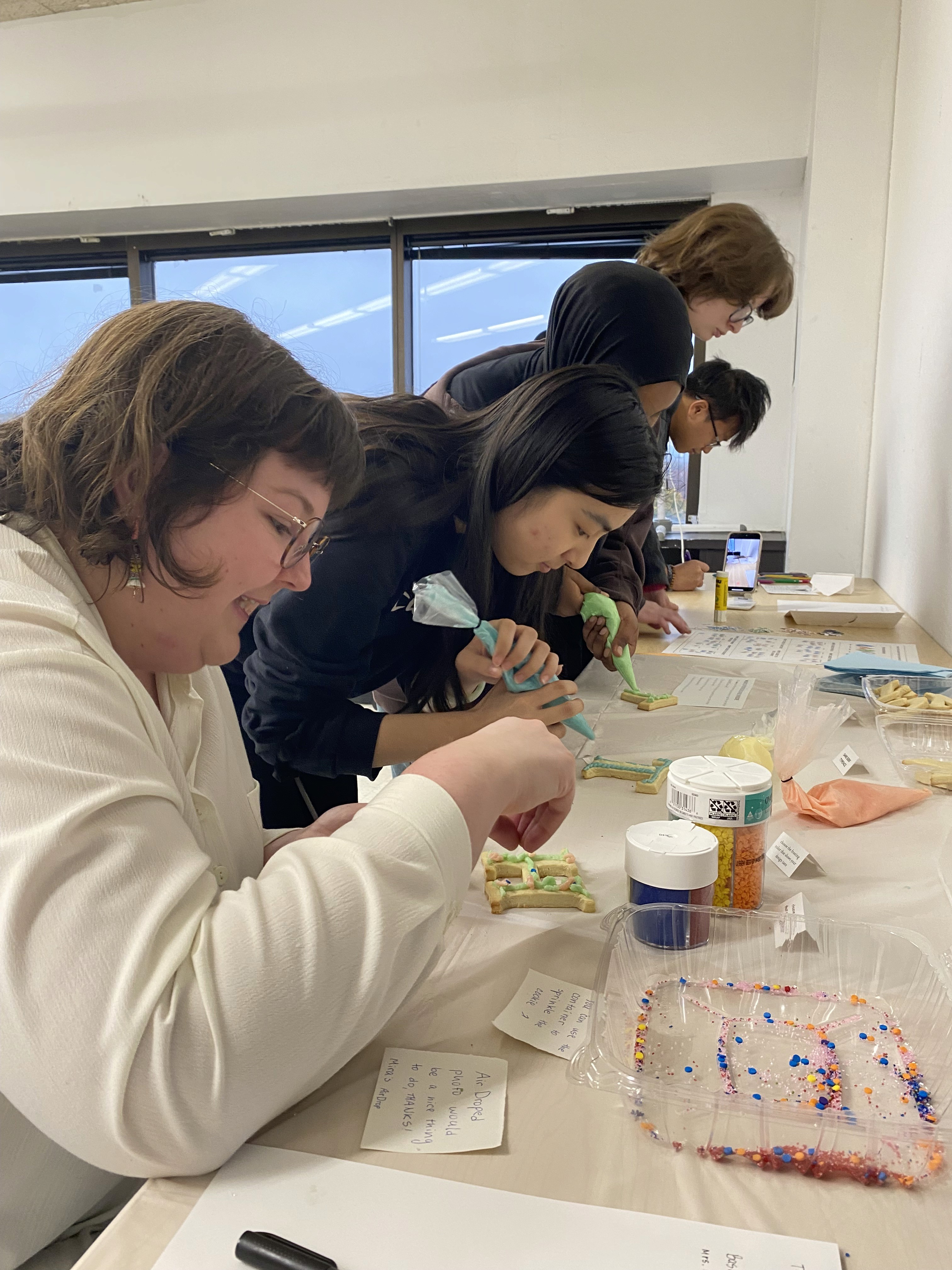
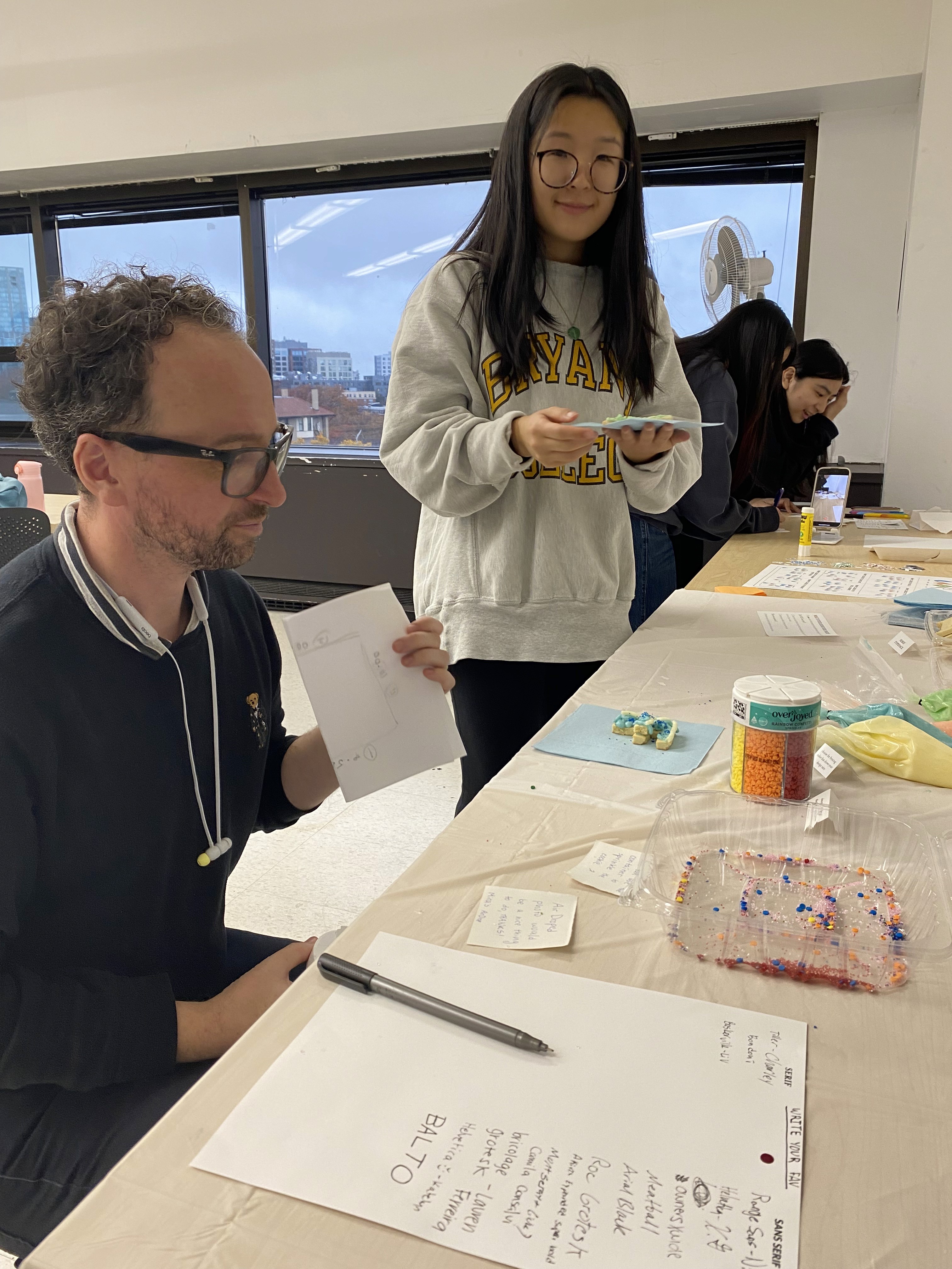
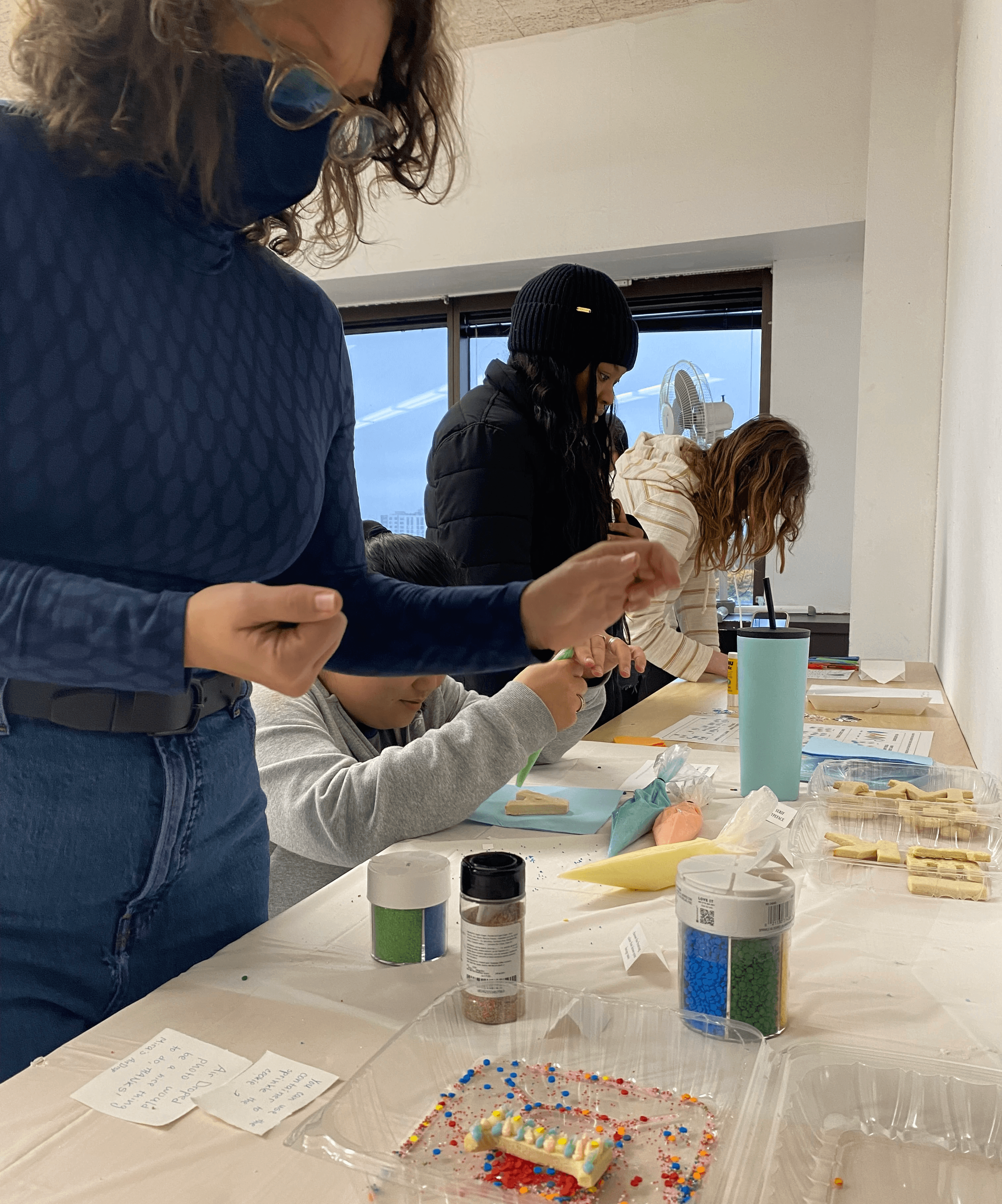
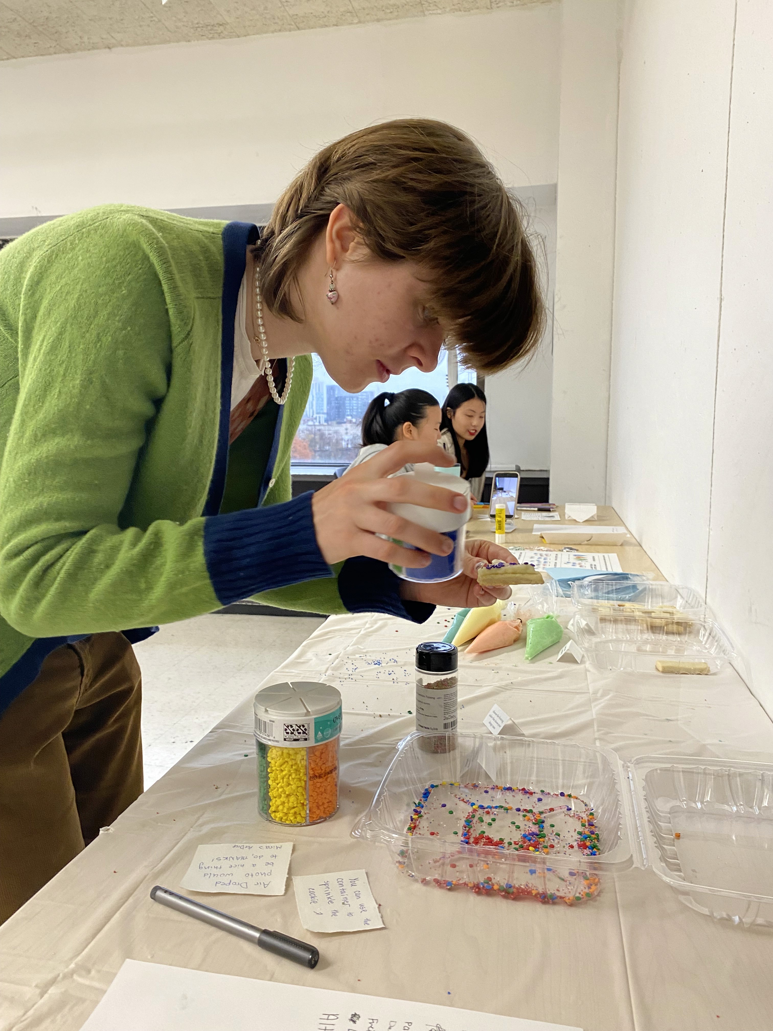
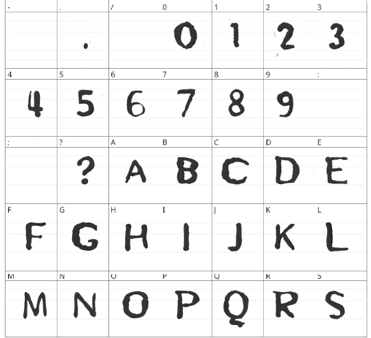
I took a picture of every cookie that was made in the class before the students can eat them. I analyzed the results to find a story in that data. The Serif cookies count was 24 and the Sans Serif was 23, only one cookie difference. After looking at the results I decided to make a fun interactive display typeface. Since the cookies had frosting, I came up with idea of layered type to make impression of cookie letter and frosting on top.
I made a grid for the letterforms based on the sugar cookie recipe ratio that I used. I used the grams as my measurement units because it's easier to work with for the smaller quantities.
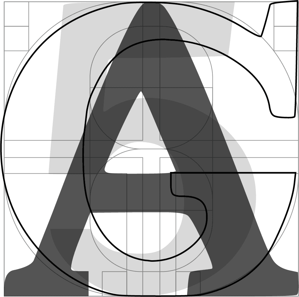
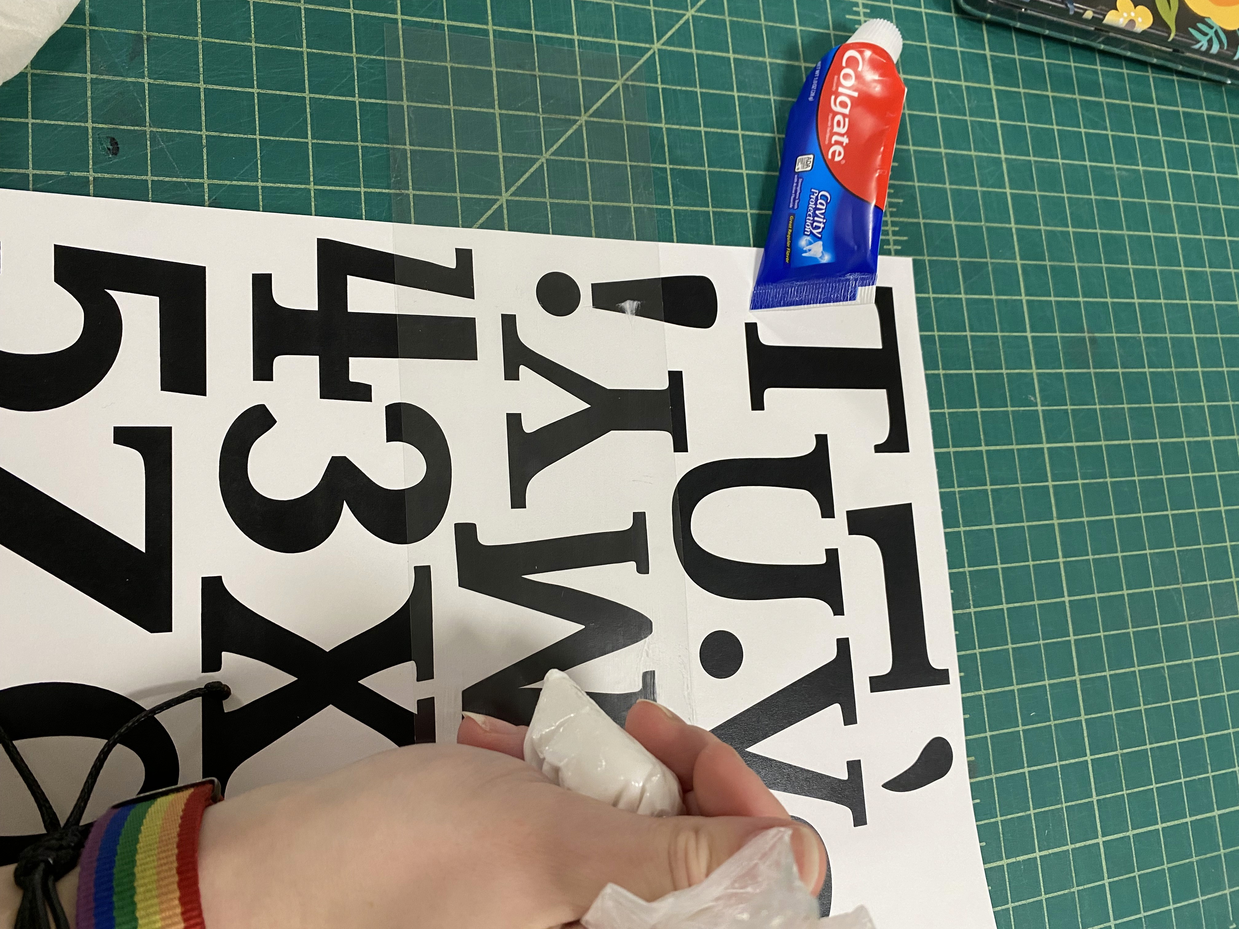
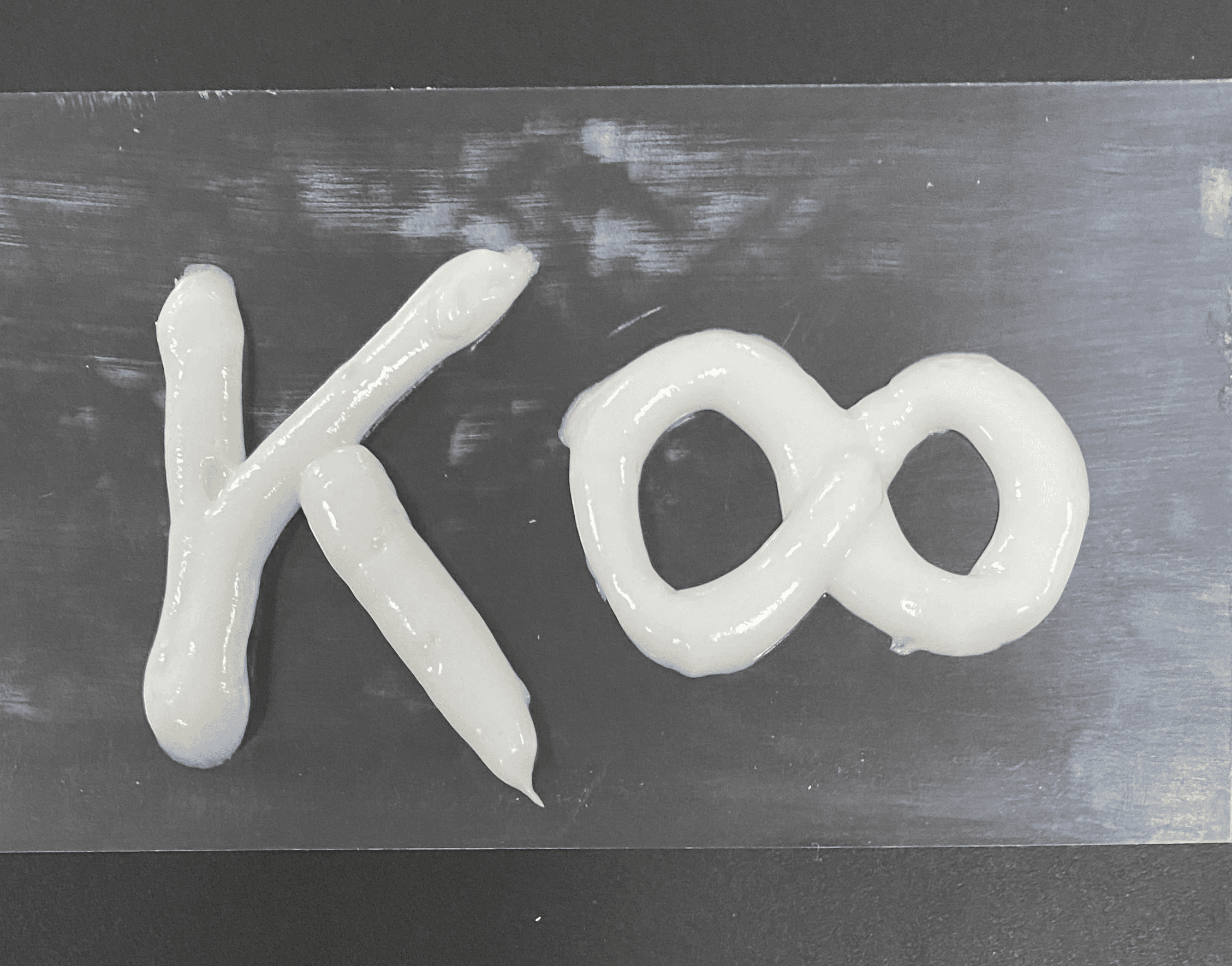
I mimicked the frosting layer by drawing over a printout of my cookie type covered with acetate using a toothpaste. I used photoshop to adjust the scale and quality of taken photos. After I tried to use a font builder to upload my letters but it was killing the texture that I was aiming to keep. So, I ended up just using the Illustrator for the frosting layer type.
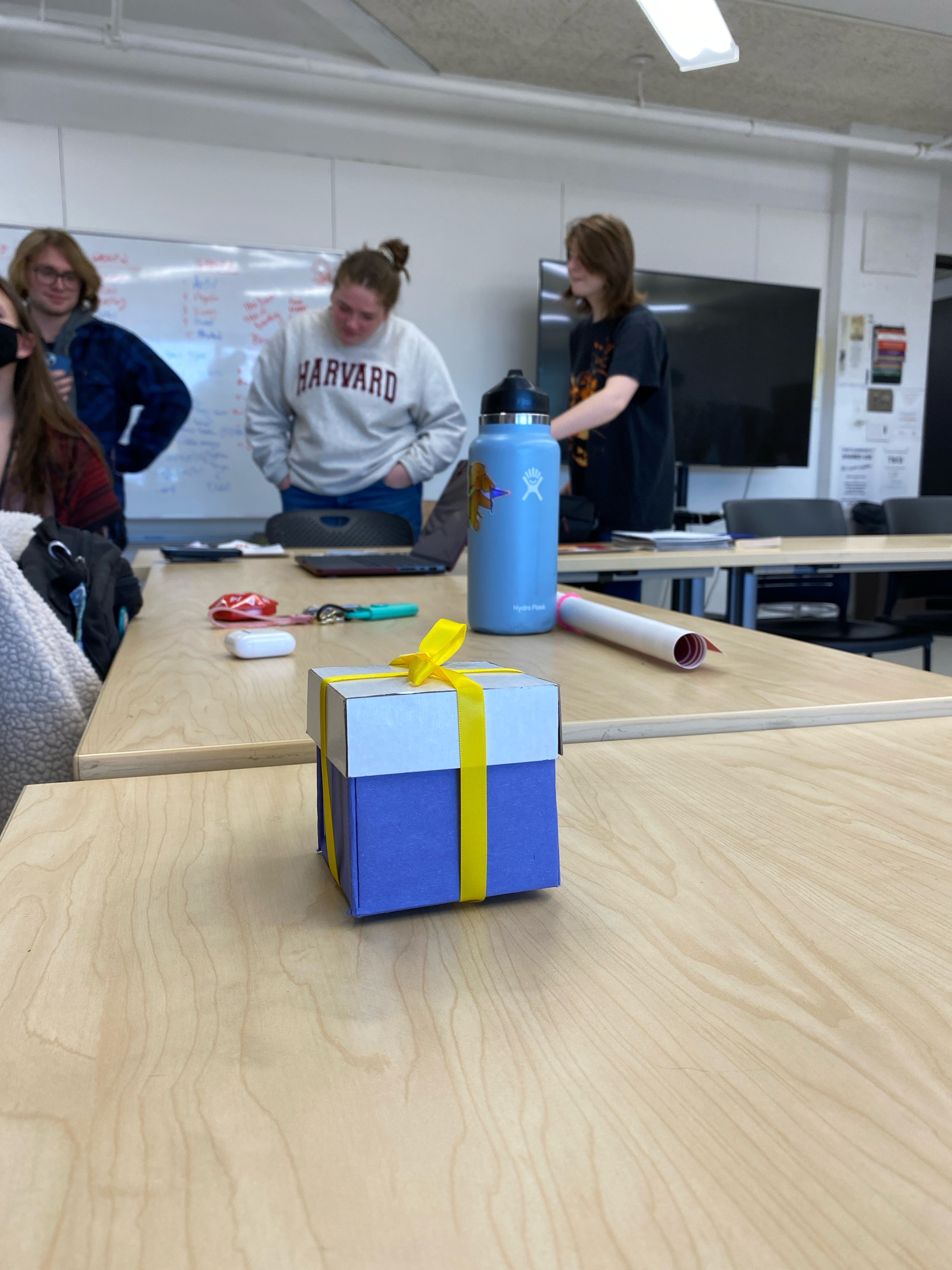
While the cookie type people can use as a regular display typeface, that functions, the frosting type could be used as a overlaying pair to the main one to make imitation of cookies.